(Discussion based off of the article The Secret to Turning Consumers Green by Stephanie Simon.)
Main Point. If you want to get people to do something or change a habit, tell them what other people are doing. It's reflective design. It works. If you deny that you are influenced by people, you are lying to yourself. Okay, well, the first 2 sentences are Ms. Simon's main points... the others are my opinions.
I think I'd be more likely to "go green" if I knew that other people were doing it routinely. There's a tactful way to peer pressure. It can't just be a big sign that says "EVERYONE'S DOING IT!" Mainly because that's the classic peer pressure line, but also because it doesn't mean anything to just say it like that- you gotta make the viewer feel it!!
For mother's day my mom told us she wanted us to buy "green" cleaning products and clean the house. It's a good feeling, buying green. I felt more excited and willing to clean. Of course, the idea was my younger sister's, but my mom thought it was cool. Apparently she's easy to please! Another story is that my dad gets really excited about buying green and he went out and bought all new light bulbs for the entire house. In addition, I avoid buying clothes made from dead animals because animals are bad for the environment when mass produced for human greed.
A prominent example of products that "go green" are household items, like cleaning products, and cars. Now many stores encourage people to reuse bags. Also it's becoming more common for packaging to be changed by manufacturers in order to be more environmentally conscious. My favorite product that changed to be greener? Winterfresh gum went from foil wrappers to paper ones.
Friday, November 19, 2010
Tuesday, November 16, 2010
So... I think we could "spiff up" our marketing strategy... How does dolling out $2 million dollars sound?
(Discussion based on article Specialty Clothing Retailers This Fall Want To Let Shoppers Know That They, Too, Are A Brand by Jennifer Steinhauer. First of all, Jen, your title is not concise- as a matter of fact, it's long at best!)
"Today brands are built emotionally,'' Ms. Lastrina said. ''You have to get a message across and show what the brand ideology means to her life."
and
''The campaign depicts women wearing very uncomplicated looks -- a simple red suit, a white blouse or a heavy fisherman's sweater -- while going about daily tasks such as walking the children to school, preparing dinner or getting a parking ticket."
Okay. Clothing Advertising. Brand Identity. These two concepts seem a bit complex to really discuss here where no one can hear my copious "likes" trying to defend my ideas... but as she says people respond emotionally to advertising and therefore to brands. So what you want your brand to feel like, you need to portray.
I find it completely appealing that a clothing ad would portray a women getting a parking ticket- it's such a cute idea! Nowadays the advertising industry has to use many different strategies to capture people. SALE SALE SALE is one way, but some specialty retailers can't always follow suit and slash every price by 50-75%. What this quote shows is how the specialty retailer is trying to portray the woman who wears their clothes; Multitasker, Cares about herself without all the fuss. That's what they want the brand to signify.
I find it completely appealing that a clothing ad would portray a women getting a parking ticket- it's such a cute idea! Nowadays the advertising industry has to use many different strategies to capture people. SALE SALE SALE is one way, but some specialty retailers can't always follow suit and slash every price by 50-75%. What this quote shows is how the specialty retailer is trying to portray the woman who wears their clothes; Multitasker, Cares about herself without all the fuss. That's what they want the brand to signify.
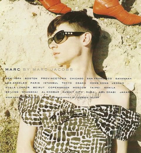 A clothing company that has an iconic ads, to me, is Marc Jacobs. There's the boy dressed in dresses and celebrities or models looking totally awkward. The colors are often a bit... off... but I notice it. That's what counts right? I mean young people from around 16-35 are bombarded with ads and the like as well as "conformity." Marc Jacobs is selling clothes and an opportunity to be unique, different- stand out.
Sure brands have made me want or not want an item. Sometimes off-brands are actually seriously problematic. Take VibramFiveFinger shoes... off brands aren't made with the same technology and purpose- they just have recreated the image. I'm a big fan of looking at high-end fashion but buying lesser (or unknown) brands for a better price. No skin off my back to not have a label on me. And some celebrities make you want or not want a product. If Keira Knightly was the model for a perfume (she is...), I'd be more willing to smell it than if, I don't know, Beyonce was the model. Then there are scandals. Like the Tiger Woods one- Do I really think Nike supports cheating? NO. They can't help it if their model turns out to be a jerk. It's all risky business! Anyway...
When you wear an outfit you want to look confident in it so that you "wear the clothes," and the clothes aren't "wearing you."I think in certain cases people define clothes... but many times what you wear "says something" about you. (Ever referred to a person as "goth?" You looked at them and their clothes and decided that they were goth. Now you have all these wonderful connotations for that person and it was all based on what s/he was wearing!!)
Sunday, November 14, 2010
Suburban Cookie Developments
(Discussion based of article Cookie Cutter Housing: Wrong Mix For Subdivisions by Rick Harrison.)
The author's main points were that "cookie cutter" homes don't please customers, they need t'go, and changing the system is much easier than everyone expects. He also through in, my favorite piece, that maybe designers should think about the customer, the people who are going to be living there, while "cooking up" a plan. It's essentially a user-based design prompt. Where's the American Spirit of innovation?
I certainly find them to be lackluster. They all look the same, they are confusing, and make everything so monotonous. There are innovative and creative architects out there! But nooo, we buy cheap homes made by the same people in some factory and act all boring and lame. Cool. I just feel this way because driving through them is so... almost creepy.... And definitely confusing- "What that the house? No, wait, was that it?" NO.
In Chelsea we have two distinct subdivisions near the downtown area. I agree that with these two the Harrison's opinion that they are lackluster and need creative improvements is so true. They are minutely different from each other! One has beige and red brick, the other has white and red brick. So. Boring. And they're not even really doing that well to boot. I remember when they built both and wondering why? No one moves here!
Thursday, November 11, 2010
1995-2015
(Discussion based on article Biggest Mistake in Web Design 1995-2015 by Vincent Flanders.)
(Look at this incredibly terrible website that he "recommends" viewing! It's super horrible! The most viscerally UNAPPEALING thing EVER.)
Flanders is all about user-friendly design. He stresses the point that a website is for VIEWERS not for the person who made it. Nearly every aspect of web design that he mentioned was to aid the person going to the site. Contrast, GIF fails, font size, "Mystery Meat" style navigation, etc. I thought it was pretty humorous the way he "responded" to hypothetical website owners who are trying to think that they're website is awesome:
"Before you start saying, 'My site also has Heroin Content so I don't have to worry about the design,' let me point out a small fact. Your site doesn't have Heroin Content. Digg.com has it, YouTube borrows a lot of it, and Google is another site that has Heroin Content."
Anyway, he also goes over Norman's design elements (Vis, Beh, and Ref). Behavioral is obvious- user-friendly design. The site has to work, be navigable, and have the ability to be viewed! Viscerally, websites have to be contrasty and, preferably, in pleasing, viewable colors. This can also encompass font size, which is critical if you, I don't know, want people to see your site. And he even goes over a bit of reflective design while talking about how, at times, reflective-important websites may be able to overrule some of his points.
I was told before reading this article that it was crappy. I disagree. I understand that the page has missing links and videos, but I don't think that is necessarily the dude's fault. There are many reasons some things may be missing- one being the fact that certain website owners may get upset by being examples of crappy design... I think that this could bring his credibility down, but what he says has obvious value no matter who is saying it. I imagine most people know that these make for poorly designed website, but until they are listed together, a person may not be as aware. Basically what I mean is that, I imagine, no one was surprised by these website flaws he pointed out.
The most important points were 1) make it make sense for the viewer, this includes purpose, navigation, and usability; and 2) make it viewable, for instance text=text, no useless GIFs, contrast, readable font shape/size/color, layout, or, again, navigation.
I pretty much agree with the man. I want the site to use contrast/color so I can see it and not strain my eyes. I don't want music or commercials or ads or animation to show up and not only annoy the crap outta me but slow the load process. Which is another thing to note, I know I don't always have high speed internet, but if a website is going to kill the bandwidth, they could at least give me the option of having an alternate site that doesn't include all their graphics and videos and whatnot. That also should be considered- the graphics and animation. I don't think people need to use the poor quality and overall lame looking graphics of the past! And animation, especially repetitive, can be distracting or plain useless. Not to mention unprofessional at best. I also strongly agree with Flanders about the navigation bar! I find it so annoying when they are weird looking and complicated and misleading. I also find a repetitive picture as a website background to be completely ugly and amateur.
I want to note that I find the Hornet Hive, or was it the Portal, (see how confusing it is already?!) to be most confusing! It took me a lifetime to figure out anything on it. It wants to be well-organized and efficient, but it is certainly over-designed and confusing.
Tuesday, November 9, 2010
SciFi: Retailing of the Future!
(Discussion based off the article The Future of Retail by Nicholas Negroponte.)
The idea of the article was pretty obvious, but a direct thesis wasn't. The closest I could come up with from him was "very soon everybody will be digital." This could be expanded (therefore narrowing... it's an inversely proportional relationship, you know?) to say: "Very soon shopping will be digital."
Norman's all about user-focused design. Negroponte says "In the digital world, consumers hold almost all the power." There you go. Negroponte also notes that "consumers will inevitably provide the pressure for change." Now, if the seller/retailer wants to stay in business, he best be thinking of how to keep them customers off the interweb. In fact he figures that shopping will end up being based mostly off of the experience itself or reflective aspect associated with the store- or at least increasing its longevity through these characteristics.
As for the author's theory on shopping... it's been over ten years and I don't know anyone who online grocery shops- yet. Yet some aspects remain true. A bookstore is a terrible place to find a book. Amazon.com is just easier and more convenient. People are rarely home to receive their packages. Many people fin that, say, clothes shopping is such a drag, they would rather just buy online. I have also noticed that many, especially car dealerships, offer the option of "shopping in your pajamas!" aka online shopping. And sometimes shops are gathering places, a place for young people to hang-out, whatever.
I don't generally like to make outward predictions, but... I would say that, yes, online shopping is likely to increase, but there are many reasons that it won't be the next big thing. I do agree with Negroponte that buying from peer-to-peer could become popular. There are many places, like craigslist, in which people sell new or used things to each other. Inexpensive. Effective. And, because of the increasing awareness of global warming and resources conservation, I think recycling and reusing products/goods will gain more momentum. I'm just waiting for the days when we are encouraged by the government to start our own home gardens!
Sunday, November 7, 2010
The Streets
Downtown Kalamazoo is one of those "in-between" cities. In between being an unknown, small city and being a big, busy city. Burdick Street, apparently, gives a good look at the "heart" of the downtown area. We didn't venture too into the street, but I assume that, that was the street we walked down- don't get me wrong, a positive aspect of Kalamazoo is their detailed road/shopping signs in their "Mall District," I just get disoriented/lost easily. Anyway, we made our observations on a Friday in early afternoon; there weren't many people out and about, but some we saw. Not exactly what is desired in the "heart" of the district, but it was also cold. It was good to see that the gardener kept up the landscaping, which I should mention was very viscerally appealing. The trees were presented in a way that I think would please the city critics, Whyte and Gibbs. It was hard for me to decide what I thought was a generator... but the majority of the stores had large windows that kept a passerby looking (especially the walk-in shoe display!). In terms of safety, it seemed very safe there. When we evaluated the street and area around the Rave, it felt less safe. I imagine it was due to the lack of people/stores/trashcans/benches and the abundance of trash/bare walls. The upside to that section, and much of downtown, is the parking- there is lots of parking available. In downtown, the sidewalk are decently wide, I imagine pretty appropriate for the amount of people using it. Generally speaking, the farther from the Mall District and stores, the less safe it feels- it's safe for shoppers.
To improve the downtown I might reorganize the assortment and location of businesses. Why are all the banks in one spot? Is that really beneficial? And the Rave, I'd imagine, is a generator. Why are there no stores located by it at all? That would bring in business! People leave the theater all happy and just-watched-a-movie-y and then they stop in at a nearby store because going home seems so lame and I mean, we're already out and about...
As I mentioned earlier, I didn't do in depth research on what stores existed, but I felt like some were missing. There didn't seem to be a variety of clothing shops and, in general, many of the shops didn't properly assert what they were selling in the first place. Plus, there wasn't much for a young person to be attracted to- I have only seen one yoga place, no "typical" clothing stores, no inexpensive stores... There are three nearby colleges and yet the Rave seemed to be the only thing likely to get used- and there's nothing nearby!
Lastly, I saw one cop car- and it was empty. I might imagine there being at least one actual cop to be seen. I also didn't see a pay-phone...Haven't seen one in a while though... Or a drinking fountain, but that's not really popular or sanitary anyway.
From the sixth chapter of William Whyte's book City:
"...but the sidewalk does work well... Cafes and delis have been putting out chairs and tables on the sidewalk..."I know, I know, Mr. Gibbs. You hate tables and chairs and local teens and solicitors. Well... I think there is a place and time for a table and a few chairs. Think about the people who have to write something or need to set their stuff down or direct their children! I know that it was such a tough thing to do, write without something hard under it. We ended up using the cement wall for the plants as seating. I'm not suggesting that it be everywhere, but... at least by the cafes and delis... oh, wait... I didn't see any of those...
Thursday, November 4, 2010
Comp/Cont
(Comparing last two posts.)
I don't think that Whyte and Gibbs are talking about the same location. Whyte clearly is focused on cities. Big cities. I felt that Gibbs was talking about small-medium cities. Cities that were once useful, but now need to add some pizazz to make them relevant. New York City doesn't really need to add pizazz to increase the amount of shoppers. Not significantly anyway. It still has abundant amounts of people. Naturally, there approaches are different. They have different agendas. Help increase patrons with organization and modernizing and then voice what works in a thriving, big city and what could have been thought of to increase function. (Gibbs and Whyte, respectively.) I believe that they are both convincing because I feel that they aren't talking about the same place. Gibbs convinces me because 1) we have the same opinion, and 2) he's thorough and explains his design suggestions well. Whyte convinces me because 1) I've never been to a big city like that so I haven't much personal knowledge to work with and 2) he gives many real-life examples of where his design suggestions actually are working out for people. They are both experienced, and reasonable, so I feel like I believe both. Based on writing style, I think due to the more down-to-earth and stream-of-conscious style that Whyte has, I would be more likely to believe his word. Gibbs could come off as a critic and a weirdo.
I'm attracted to a balanced number of people around. Not because of safety, I'm pretty indifferent about safety. I like style, as in what style a store is going for. On that note, I'm repelled by a city with a theme- especially if it's not at a site where the point is to have a theme. Greenfield Village. Good. Random town that is trying to look like the "olden days." Bad. Very bad. I like cities to be less uniform. (By the way, I love Greenfield Village.) I'm attracted to brick and stone. I'm visually attracted to dirty, rundown cities. I do not, though, want to shop there. I just want to look at it. I'm attracted to professionalism. Mom and Pop stores freak me out... they just seem so sketchy. I'm attracted to bright, yet soft lighting. Not harsh and makes me look totally yellow and gross and washed out, but also not dark and creepy. Generally, I care less about cleanliness in the street than in an actual store. It's hard to really say what is attractive and repelling when I have to try and remember what being in a city is like...
Subscribe to:
Posts (Atom)